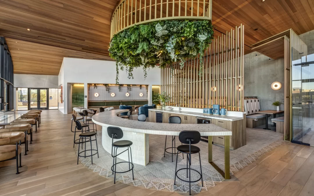
Brand-Specific Color Palette: The Foundation of Visual Identity in Hospitality
Color is one of the most powerful tools in design. It influences perception, evokes emotions, and creates memorable impressions. In the hospitality industry, where the guest experience is paramount, a brand-specific color palette plays a crucial role in reinforcing brand identity and enhancing the ambiance of a space. From lobbies to guestrooms, restaurants to spas, the strategic use of colors creates a cohesive and immersive environment that guests associate with the brand.
What is a Brand-Specific Color Palette?
A brand-specific color palette is a thoughtfully curated collection of colors that embodies the essence of a brand. It is more than just a selection of visually appealing hues—it reflects the brand’s personality, values, and target audience. These colors are applied across all aspects of design, from interior spaces to marketing materials, creating a consistent and recognizable identity.
For hospitality brands, this color palette can define the overall guest experience. Whether it’s the calming blues of a beachfront resort or the rich golds of a luxury hotel, color sets the tone for how guests perceive and interact with the space.
The Psychology of Color in Hospitality Design
Colors are not just decorative—they carry psychological significance. Understanding the impact of different colors is essential for creating a brand-specific palette that resonates with guests:
- Warm Colors (Red, Orange, Yellow):
- Evoke energy, warmth, and passion.
- Commonly used in vibrant spaces like restaurants and lounges.
- Cool Colors (Blue, Green, Purple):
- Promote relaxation, calmness, and trust.
- Often found in spas, guestrooms, and wellness retreats.
- Neutral Colors (Beige, Gray, White):
- Convey sophistication, cleanliness, and simplicity.
- Serve as foundational colors in luxury and minimalist designs.
- Accent Colors:
- Used sparingly to create focal points and highlight brand-specific elements.
Benefits of a Brand-Specific Color Palette
- Strengthens Brand Recognition: A consistent color palette helps guests immediately identify and remember the brand.
- Creates Emotional Connections: Colors evoke feelings that align with the brand’s values, fostering deeper emotional ties with guests.
- Enhances Guest Experience: The right colors can make spaces feel more inviting, comfortable, and aligned with guest expectations.
- Unifies Design Elements: A cohesive color palette ensures harmony across all design components, from furniture to decor.
- Supports Marketing Efforts: When used consistently across digital and print materials, the color palette reinforces the brand’s visual identity.
How to Develop a Brand-Specific Color Palette for Hospitality
- Understand the Brand Identity: Begin by identifying the core values, mission, and personality of the brand. Is the brand luxurious, youthful, sustainable, or traditional? These attributes will guide color selection.
- Consider the Target Audience: Think about the preferences and expectations of your guests. Families may prefer warm, vibrant colors, while business travelers might appreciate muted, professional tones.
- Incorporate Local Inspiration: For hotels and resorts, integrating colors inspired by the local environment—such as ocean blues, desert oranges, or forest greens—adds authenticity.
- Balance Primary and Accent Colors: Choose one or two primary colors that dominate the design and complement them with secondary and accent shades.
- Test in Real Settings: Before finalizing the palette, test it in the actual space to observe how it interacts with lighting, materials, and decor.
Applications of Brand-Specific Color Palettes in Hospitality Design
- Lobby Spaces: The lobby is the first impression guests have of a property. A strong color palette here sets the tone for the entire stay.
- Guestrooms: Colors in guest rooms should align with the brand while prioritizing guest comfort. For example, calming neutrals paired with branded accent colors create a relaxing yet cohesive experience.
- Restaurants and Bars: Use colors that enhance the dining experience. Warm tones can stimulate appetite, while deep, rich hues add sophistication.
- Event Spaces: Flexible palettes that can adapt to different events while maintaining the brand’s identity are essential.
- Digital and Print Materials: The color palette should be mirrored in marketing materials, including websites, brochures, and social media, ensuring consistency across all platforms.
Real-World Example: Brand-Specific Color Palette in Action
The Ritz-Carlton: A Symphony of Gold and Navy Blue
The Ritz-Carlton exemplifies the power of a brand-specific color palette. Its signature navy blue and gold color scheme is instantly recognizable and synonymous with luxury and sophistication. These colors are seamlessly integrated into the hotel’s interiors, from the plush navy seating in the lobbies to gold-accented fixtures in the guestrooms. The same palette extends to its marketing materials, creating a cohesive and memorable identity that guests associate with opulence and exclusivity.
Challenges in Implementing a Brand-Specific Color Palette
- Adapting to Different Locations: Global hospitality brands must balance a consistent color palette with the need to reflect local influences.
- Avoiding Overuse: While consistency is key, overusing brand colors can make spaces feel monotonous. Strategic application is crucial.
- Ensuring Longevity: Colors should be timeless to avoid frequent redesigns, while still feeling modern and relevant.
Future Trends in Color Use for Hospitality Brands
- Sustainability-Inspired Colors: Earth tones, greens, and blues reflecting eco-conscious values are becoming more popular.
- Dynamic and Adaptive Palettes: With the advent of smart lighting and materials, spaces can dynamically adjust colors based on time of day or guest preferences.
- Personalized Color Experiences: Technology may allow guests to customize room lighting and decor colors to suit their mood or style.
Conclusion
A brand-specific color palette is far more than a visual choice—it’s a strategic tool that enhances brand recognition, evokes emotions, and elevates guest experiences. By carefully selecting and applying colors that align with their identity, hospitality brands can create environments that resonate deeply with guests, turning every stay into a memorable and impactful journey.


