Brand Color Extension Interiors
What Are Brand Color Extension Interiors?
Brand Color Extension Interiors is a design philosophy that extends a brand’s color palette into its physical spaces, creating a seamless integration of brand identity and interior design. This approach goes beyond mere decoration; it transforms environments into immersive brand experiences that evoke emotions, tell stories, and reinforce brand values.
Think of it as bringing your brand to life in a tangible, 3D space. Whether it’s a corporate office, a retail store, or a hospitality venue, every corner, wall, and piece of furniture becomes a canvas for your brand’s colors, tone, and personality. This ensures consistency across all touchpoints, from your logo and marketing materials to the physical spaces your customers or employees interact with daily.
Why Is It Important?
In today’s competitive landscape, brands need to stand out and create memorable experiences. Your interior spaces are often the first physical interaction customers have with your brand. By extending your brand colors into these spaces, you:
- Strengthen Brand Recognition: Consistent use of colors reinforces your brand identity, making it instantly recognizable.
- Enhance Emotional Connection: Colors evoke emotions and can make spaces feel welcoming, inspiring, or calming, depending on your brand ethos.
- Create Cohesion: Aligning your interiors with your brand identity ensures a unified experience across all platforms.
- Differentiate Your Brand: Unique and thoughtfully designed spaces set you apart from competitors.
Key Elements of Brand Color Extension Interiors
- Color Palette Integration: Use your brand’s primary, secondary, and accent colors strategically throughout the space. For example, walls, furniture, and decor can reflect your brand’s hues.
- Material and Texture: Incorporate materials and textures that complement your brand colors. For instance, a tech-savvy brand might use sleek, metallic finishes, while a wellness brand could opt for natural, earthy textures.
- Lighting: Lighting plays a crucial role in how colors are perceived. Use it to highlight key areas and enhance the mood.
- Experiential Design: Go beyond aesthetics by creating interactive elements that tell your brand’s story. This could be through custom artwork, signage, or interactive displays.
Benefits of Brand Color Extension Interiors
- Boosts Brand Loyalty: Consistent and immersive experiences foster trust and loyalty among customers.
- Improves Employee Morale: For corporate spaces, brand-aligned interiors can inspire and motivate employees, creating a sense of pride and belonging.
- Enhances Customer Experience: Cohesive design creates a welcoming atmosphere that encourages customers to stay longer and engage more deeply.
- Adds Value to Your Space: Thoughtfully designed interiors increase the perceived value of your brand and space.
Practical Applications
- Retail Stores: Use your brand colors to create a shopping environment that reflects your brand’s personality. For example, a luxury brand might use rich, bold colors paired with elegant finishes, while a youth-focused brand could opt for vibrant, playful tones.
- Corporate Offices: Align your office interiors with your brand identity to create a workspace that inspires creativity and productivity. Incorporate brand colors into meeting rooms, lounges, and even workstations.
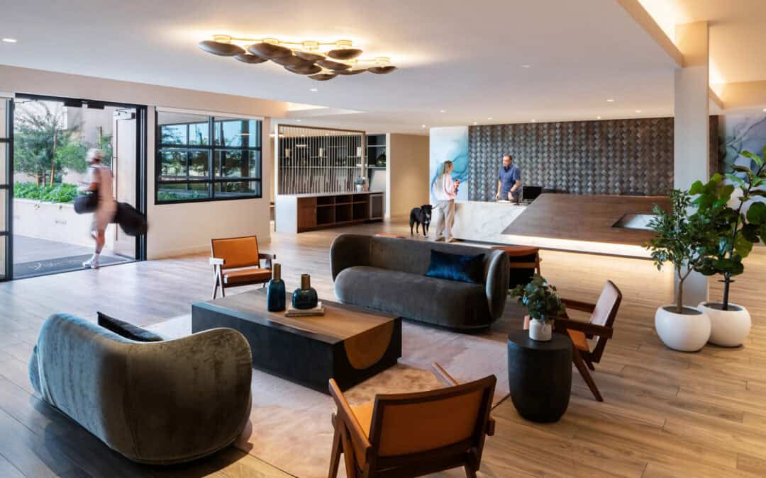
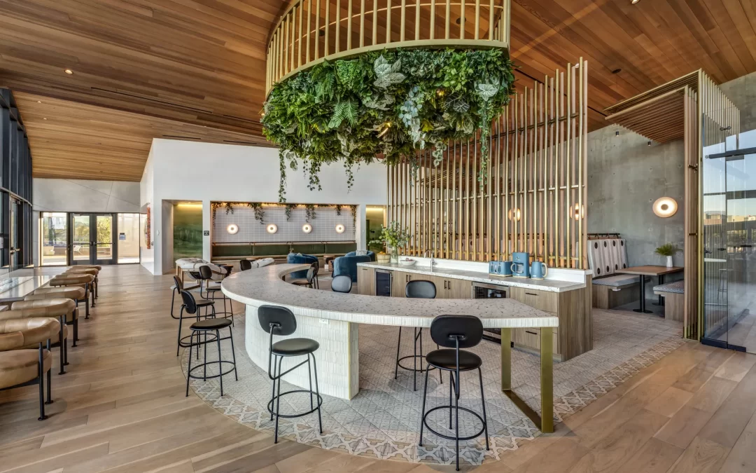
- Hospitality Venues: Hotels, restaurants, and cafes can use brand colors to create memorable guest experiences. From lobby décor to room interiors, every detail can reflect your brand’s essence.
- Healthcare Spaces: Clinics and wellness centers can use calming brand colors to create a soothing environment for patients and visitors.
Examples of Brand Color Extension Interiors
- Apple Stores: Known for their minimalist design, Apple stores use the brand’s signature white and gray palette to create a sleek, modern environment that aligns with its product design.
- Starbucks: Starbucks uses its iconic green color throughout its cafes, creating a consistent and recognizable experience worldwide.
- Coca-Cola: The brand’s red and white colors are prominently featured in its offices and event spaces, reinforcing its bold and energetic identity.
Tips for Implementing Brand Color Extension Interiors
- Start with Your Brand Guidelines: Refer to your brand’s style guide to ensure you’re using the correct colors, fonts, and design elements.
- Balance Brand Colors with Neutral Tones: Avoid overwhelming the space by pairing your brand colors with neutral tones like white, gray, or beige.
- Consider the Psychology of Color: Understand the emotions and associations tied to your brand colors and use them strategically to evoke the desired response.
- Work with a Professional Designer: Collaborate with interior designers who specialize in brand integration to ensure a cohesive and impactful result.
- Test and Iterate: Experiment with different shades and combinations to find the perfect balance that reflects your brand and resonates with your audience.
Challenges and Solutions
- Color Overload: Too much of one color can feel overwhelming. Solution: Use your brand colors as accents rather than dominating the entire space.
- Mismatched Aesthetics: Brand colors may clash with the existing architecture. Solution: Adapt your color palette to complement the space while staying true to your brand.
- Budget Constraints: Implementing a full-scale redesign may be costly. Solution: Start small by incorporating brand colors through decor, furniture, or wall accents.
Infographic Table: Brand Color Extension Interiors at a Glance
| Element | Key Consideration | Example |
|---|---|---|
| Color Palette | Use primary, secondary, and accent colors | Apple’s white and gray theme |
| Lighting | Enhance mood and highlight key areas | Warm lighting in luxury hotel lobbies |
| Texture | Complement brand colors with materials | Natural wood for a wellness brand |
| Experiential | Create interactive, brand-specific elements | Coca-Cola’s red-themed event spaces |
Conclusion
Brand Color Extension Interiors is more than a design trend—it’s a strategic way to bring your brand to life in physical spaces. By thoughtfully integrating your brand colors into interiors, you create cohesive, memorable environments that resonate emotionally and strategically. Whether you’re designing a retail store, corporate office, or hospitality venue, this approach ensures your brand’s identity shines through every detail. Start small, think big, and watch your spaces transform into powerful brand experiences.