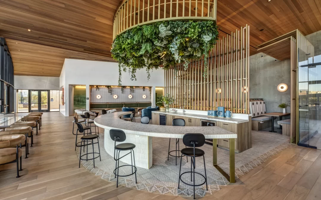
High-Contrast Color Scheme Use
High-contrast color schemes are a powerful tool in both interior design and branding. They involve pairing colors that sit on opposite ends of the color spectrum, creating a bold and visually striking effect. This approach is often used to evoke strong emotions, draw attention, and make a statement. Whether you’re designing a room or building a brand identity, understanding how to use high-contrast colors effectively can elevate your work to a whole new level.
High-contrast color schemes are more than just about aesthetics—they’re about creating experiences. At DyeLot, we believe in crafting designs that tell a story and leave a lasting impression. In this article, we’ll dive into what high-contrast color schemes are, their benefits, practical uses, and tips for incorporating them into your design projects.
What is a High-Contrast Color Scheme?
A high-contrast color scheme involves pairing colors that are drastically different in tone, brightness, or hue. Think black and white, navy and gold, or bright yellow and deep purple. These combinations create a dynamic visual tension that immediately captures attention.
In interior design, high-contrast schemes can make a room feel bold and energetic, while in branding, they can convey confidence and innovation. The key to success lies in balancing the contrast to ensure the design remains cohesive and harmonious.
Benefits of Using High-Contrast Color Schemes
-
Visual Impact
High-contrast colors instantly grab attention, making them ideal for creating focal points or highlighting key elements in a space or design. -
Emotional Connection
Bold color combinations can evoke strong emotions, such as excitement, sophistication, or even serenity, depending on the colors chosen. -
Memorability
High-contrast designs are hard to ignore, making them more likely to leave a lasting impression on viewers or visitors. -
Versatility
These schemes can be adapted to various styles, from modern and minimalistic to eclectic and luxurious. -
Enhanced Brand Identity
In branding, high-contrast colors can help businesses stand out in a crowded market, conveying a sense of uniqueness and innovation.
Uses of High-Contrast Color Schemes
In Interior Design
- Accent Walls: A high-contrast accent wall can transform a room, adding depth and character.
- Furniture and Decor: Bold furniture or decor pieces in contrasting colors can become the centerpiece of a space.
- Lighting: Using light and dark contrasts can enhance the ambiance of a room, creating drama or warmth.
In Branding
- Logos and Visual Identity: High-contrast logos are easily recognizable and can convey confidence and boldness.
- Marketing Materials: From business cards to websites, high-contrast designs ensure your brand stands out.
- Retail Spaces: Applying high-contrast schemes in physical spaces can create an unforgettable customer experience.
Tips for Implementing High-Contrast Color Schemes
-
Choose Bold but Complementary Colors
Select colors that contrast strongly but still work well together. For example, pairing deep blue with bright orange creates a striking yet balanced effect. -
Balance is Key
Avoid overwhelming your design by balancing high-contrast elements with neutral tones or simpler patterns. -
Consider the Mood
Think about the emotions you want to evoke. High-contrast schemes can feel energetic, luxurious, or sophisticated, depending on the colors used. -
Test in Different Lighting
Colors can appear differently under various lighting conditions. Always test your scheme in the actual environment where it will be used. -
Incorporate Textures
Adding textures can soften the boldness of high-contrast designs, making them more inviting and layered.
Examples of High-Contrast Color Schemes
-
Black and White
A timeless combination that exudes elegance and simplicity. Perfect for modern or minimalist designs. -
Navy and Gold
A luxurious pairing that feels regal and sophisticated, ideal for high-end branding or interiors. -
Red and Green
A bold and festive combination that can be used to create a sense of energy and excitement. -
Yellow and Purple
A vibrant and playful pairing that works well in creative or youthful spaces.
Infographic Table: High-Contrast Color Scheme Pairings
| Color Combination | Mood/Effect | Best Use Cases |
|---|---|---|
| Black and White | Elegant, Minimalist | Modern Interiors, Logos |
| Navy and Gold | Luxurious, Sophisticated | High-End Branding, Retail |
| Red and Green | Energetic, Festive | Event Spaces, Marketing |
| Yellow and Purple | Playful, Creative | Youthful Branding, Offices |
| Teal and Orange | Bold, Modern | Websites, Restaurants |
Common Mistakes to Avoid
-
Overusing Contrast
Too much contrast can feel jarring and overwhelming. Use it strategically to highlight key elements. -
Ignoring Context
Consider the purpose of the space or brand. A high-contrast scheme that works for a trendy café might not suit a tranquil spa. -
Neglecting Neutral Tones
Neutrals like gray, beige, or white can help balance high-contrast designs, preventing them from feeling too intense.
Final Thoughts
High-contrast color schemes are a dynamic and versatile tool for creating memorable designs and brand identities. By understanding their benefits, uses, and implementation tips, you can harness their power to make a bold statement in your projects. At DyeLot, we believe in using color to tell authentic stories and create impactful experiences. Whether you’re designing a space or building a brand, high-contrast schemes can help you stand out and leave a lasting impression.


