Neutral Color Schemes: The Pillar of Tranquility in Hospitality Design
In the realm of hospitality design, crafting an inviting atmosphere is essential, as it greatly influences guest satisfaction and brand perception. Among the diverse tools available to designers, neutral color schemes stand out for their ability to offer timeless elegance and flexibility. Neutral palettes, encompassing shades of beiges, grays, whites, and muted earth tones, provide a versatile foundation that not only soothes the senses but also seamlessly integrates with various design elements.
The Significance of Neutral Colors in Hospitality Spaces
Neutral color schemes are famously adaptable, allowing spaces to transition effortlessly between different functions and clientele. In a hotel context, these colors contribute to a serene atmosphere that appeals to all guests, whether they are business travelers seeking rest after a busy day or tourists looking to unwind. The subtlety and sophistication of neutral colors foster an environment where other elements can shine without overwhelming the senses.
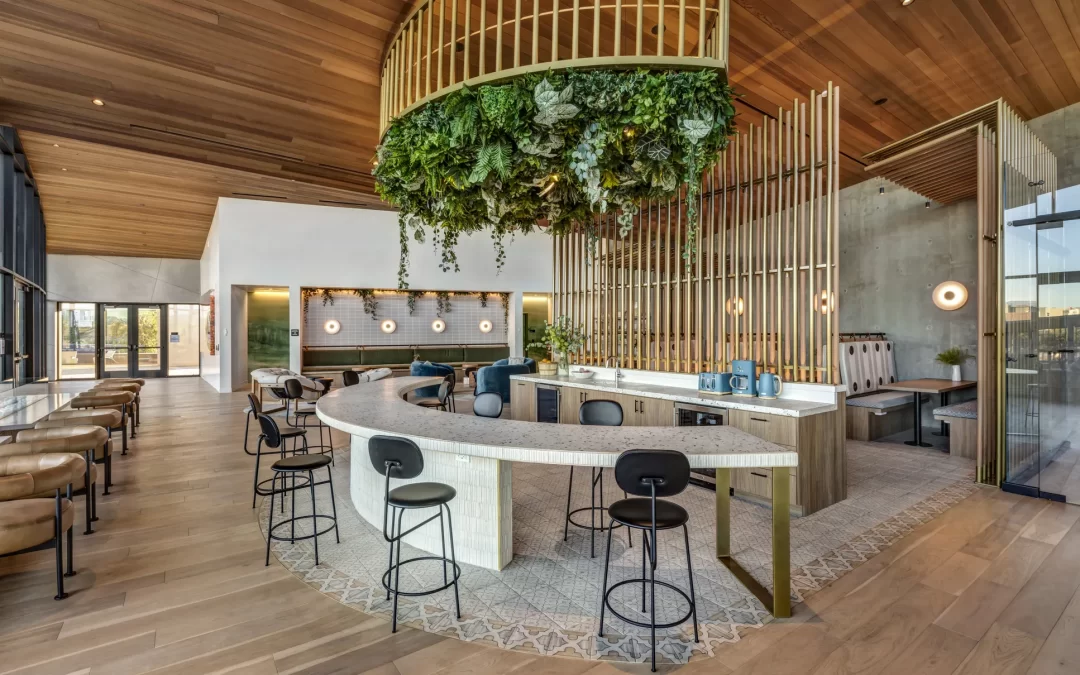
– **Creating a Calming Environment:** Neutral tones are known to evoke a sense of tranquility and calm. In hospitality spaces, where guests arrive with high expectations for comfort and relaxation, these colors play a crucial role. The simplicity of neutral palettes helps in reducing visual noise, crafting a peaceful ambiance that encourages guest relaxation and rejuvenation.
– **Flexibility and Compatibility:** One of the greatest advantages of neutral color schemes is their flexibility. These shades serve as a perfect backdrop, complementing any style or theme while also accommodating seasonal decor changes. For example, a hotel lobby might modestly transform from spring freshness to the warmth of fall with minimal adjustments, thanks to the neutrality of its core color palette.
– **Highlighting Other Design Elements:** Neutral colors allow other elements of design, such as artwork, furnishings, and architectural features, to stand out. This emphasis is particularly beneficial in hospitality spaces that wish to showcase unique decorative items or local art, as the quiet backdrop enhances these features rather than competes with them.
Neutral Schemes and Brand Identity
In hospitality, aligning the interior design with brand identity is paramount. Neutral color schemes contribute significantly to this alignment by offering a clean slate that can convey specific brand messages.
– **Reinforcing Brand Values:** For brands that emphasize simplicity, elegance, or sophistication, neutral tones serve as a reflection of these values. High-end resorts, for instance, often opt for warm neutrals like ivory or taupe, which exude luxury and class without overshadowing the brand’s core message of refined exclusivity.
– **Accommodating Diverse Design Themes:** Neutrals can adeptly support a range of design aesthetics, from modern minimalism to rustic charm. They blend seamlessly with organic materials like wood and stone, often used in hotels that opt for eco-friendly design, aligning with brands that advocate sustainability.
Practical Applications of Neutral Color Schemes
Understanding how to implement neutral colors effectively involves more than just painting walls in off-white hues. It requires a nuanced approach to material selection, texture, and accents.
– **Layering Textures and Materials:** To infuse depth into neutral spaces, designers use various textures and materials. Linen, wool, leather, and natural stone are popular choices that add dimension and interest. Strategically placed textures prevent spaces from feeling sterile and instead create a rich tactile experience.
– **Incorporating Accents:** While neutrals serve as the primary palette, using contrasting accents can enliven the space. This might include metallic finishes, darker wood tones, or soft pastels introduced through furnishings and decor. Accents can change with seasons, providing fresh insights while retaining a cohesive core design.
Neutral Colors in Practice: A Hospitality Case Study
Consider the example of a boutique hotel nestled by the seaside. The hotel’s design capitalizes on a neutral palette of sand, stone, and sea foam grays, mirroring the natural surroundings. In guest rooms, soft ivory walls provide a backdrop for turquoise throws and art prints depicting local marine life, bringing a sense of place into the room while maintaining overall calmness.
The lobby area, with its large windows and views of the ocean, uses neutral tones to ensuring the outside view is the star attraction, enhancing the guest’s connection with the environment. This strategic use of neutrals conveys a message of relaxation and respect for nature, perfectly aligning with the hotel’s brand ethos.
Conclusion
Neutral color schemes, when skillfully used, transcend mere aesthetics to become pivotal in crafting memorable hospitality experiences. These colors do more than provide a pleasing visual experience; they enhance guest comfort, underscore brand values, and allow for adaptable, timeless design. As the hospitality industry continues to evolve, embracing the elegance of neutral paint remains a sophisticated choice, ensuring spaces that resonate with every guest and stand the test of time.