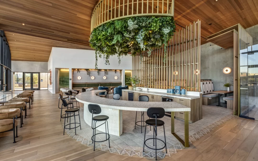
Pop of Color in Hospitality Design: Transforming Spaces and Experiences
In the world of hospitality design, where creating memorable experiences is paramount, the thoughtful use of color can significantly impact how spaces are perceived by guests. Introducing a ‘pop of color’—a technique that involves incorporating bold or contrasting colors into a design palette—not only adds visual intrigue but also enhances the overall ambiance of a space. In this context, color becomes more than just decoration; it serves as an essential tool in reinforcing brand identity, influencing guest emotions, and even guiding navigation throughout a property.
The Power of Color in Design
Color is a powerful element that can evoke emotions, signal intentions, and express identities. In hospitality settings, where first impressions are crucial and guest experiences are at the forefront, using color strategically can elevate a brand’s presence in subtle yet impactful ways.
- Emotional Influence: Colors have psychological impacts. For example, blues and greens are often associated with calmness and relaxation, ideal for spas and rest areas, while reds and oranges can stimulate energy and warmth, perfect for dining spaces or vibrant bars.
- Brand Reinforcement: Colors can be a direct representation of a brand’s ethos. A luxury hotel chain might use gold or deep purples to signify opulence, whereas a trendy boutique hotel might opt for bold, vibrant hues to appeal to a younger demographic.
- Guiding Experience: Different areas within a hospitality environment can be distinguished using color, helping guests to navigate spaces intuitively. A pop of color can denote special zones such as a reading nook or a children’s play area, making the space more interactive and guest-friendly.
Implementing a Pop of Color in Hospitality Spaces
The strategic implementation of a pop of color involves more than simply splashing vivid hues across a room. It requires a nuanced understanding of design principles and guest interaction.
1. Accent Walls and Features
One of the most direct methods to incorporate a pop of color is through accent walls or standout architectural features. These elements instantly draw attention and can be tailored to reflect the brand’s identity. For example, a bold teal wall in a hotel lobby might highlight elements of the local culture or evoke a sense of tranquility.
2. Furnishings and Decor
Furnishings provide an excellent opportunity to introduce color into hospitality environments. Colorful chairs, art pieces, or even floral arrangements can serve as focal points that enhance the existing design without overwhelming the space. These elements can be updated relatively easily, allowing for seasonal or thematic changes.
3. Textiles and Patterns
Textiles such as rugs, curtains, and throw pillows are flexible tools for adding color and can significantly influence a space’s aesthetic. Choosing patterns that incorporate key brand colors can unify disparate areas of a hotel or resort, solidifying the overall design theme.
Considerations for Effective Use of Color
While a pop of color can enhance a space’s appeal, it is vital to approach color usage with careful planning and consideration of the overall ambiance and guest journey.
- Balance and Harmony: Colors should complement the existing palette to avoid visual clutter. Complementary or split-complementary color schemes can be used to create balance.
- Cultural Sensitivity: In international settings, cultural implications of colors should be considered to ensure they resonate positively with guests from different backgrounds.
- Sustainability: Choosing eco-friendly paints and fabrics not only aligns with sustainable practices but can also appeal to environmentally conscious travelers, reinforcing a brand’s commitment to sustainability.
Case Study: A Vibrant Touch in a Boutique Hotel
Consider a boutique hotel in Miami that successfully utilizes a pop of color to enrich guest experience and highlight local culture. The hotel’s design incorporates vibrant hues reminiscent of the surrounding Art Deco architecture, with teal, coral, and sunshine yellow adorning various elements from wall art to furnishings. The color palette not only enhances the visual appeal but also immerses guests in the lively, tropical essence of Miami.
The hotel’s lobby features a striking teal reception desk that serves as a visual anchor, while the adjoining lounge area is dotted with coral lounge chairs against a backdrop of palm tree motifs. This cohesive design approach not only helps in creating an unforgettable ambiance but also positions the hotel’s brand as a vibrant retreat that is uniquely tied to its locale.
Conclusion
In the hospitality industry, where ambiance plays a crucial role in guest satisfaction, the harmonious use of a pop of color can be transformative. It elevates the guest experience by arousing emotions, creating visual interest, and distinguishing a brand in a competitive market. By thoughtfully integrating color into design elements, hospitality businesses can create distinctive environments that captivate and resonate with their guests, fostering memories that linger long after their stay. Through color, spaces are not only seen but felt—an invaluable advantage in crafting memorable guest experiences.


