Understanding the Impact of Neutral Tones in Hospitality Design
In the world of hospitality design, the choice of colors goes beyond mere aesthetics. It encapsulates a brand’s identity, influences guest perceptions, and plays a crucial role in crafting memorable experiences. Among the array of color choices, timeless neutral tones — including shades like beige, taupe, gray, and ivory — hold a unique appeal. These colors do not shout for attention but instead provide a subtle elegance that enhances the guest experience in any hospitality setting.
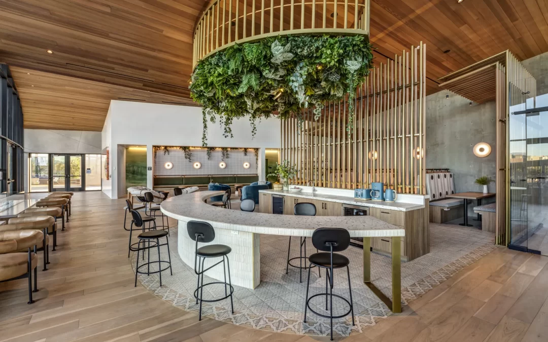
The subtleties of Neutral Tones
Neutral tones are the backbone of interior design, serving as a canvas upon which other design elements can be highlighted. These shades are favored for their versatility and timelessness, qualities essential for spaces intended to endure trends and seasons. In hospitality, they offer numerous advantages:
- Versatility: Neutral tones offer a flexible foundation that supports a variety of other colors and styles, making them adaptable to different themes and design updates.
- Ease of Coordination: They complement other colors effortlessly, allowing for easy integration of furniture, artwork, and accessories.
- Calming Effect: Neutrals have a calming effect on the psyche, promoting relaxation and tranquility, which are desirable traits in hospitality environments.
- Timelessness: Unlike bold colors, neutral tones do not quickly go out of style, thus ensuring the design remains relevant for longer periods.
Implementing Neutral Tones in Hospitality Spaces
When incorporated thoughtfully, neutral tones can transform a hospitality space, enhancing both functionality and aesthetics. Here are several strategies for effectively using these hues:
1. Layering with Textures
Neutral palettes can sometimes risk appearing flat or uninteresting if not complemented with variety. Introducing different textures — such as wood, stone, textiles, and metals — can add depth and interest. For instance, a hotel lobby might feature beige stone flooring, taupe velvet seating, and wooden accents, each texture bringing a unique element to the cohesive neutral base.
2. Using Accent Colors
While neutrals form the backdrop, strategic use of accent colors can enliven a space without overwhelming it. A gray-toned backdrop can be enhanced with vibrant throw pillows or artwork that injects personality and aligns with seasonal trends or brand identity.
3. Emphasizing Natural Light
Neutral colors naturally reflect light, making spaces appear larger and more inviting. Leveraging large windows, open spaces, and strategic mirrors can amplify this effect, enhancing the comfort and appeal of the space.
Neutral Tones and Branding
In hospitality, design is an extension of brand identity. Neutral tones can speak volumes about a brand’s values and target audience:
- Luxury and Sophistication: Many upscale brands opt for muted tones like champagne and soft gray to convey elegance and exclusivity.
- Sustainability and Nature: Earthy neutrals such as taupe and olive reflect a commitment to eco-friendliness and emphasize harmony with nature.
- Timeless Elegance: Neutrals have an enduring quality, ideal for brands that wish to portray timeless appeal and durability.
Case Study: Neutral Tones in Practice
Consider a boutique hotel that has embraced a serene color palette of ivory, cream, and soft browns. Upon entering the lobby, guests are enveloped in a tranquil atmosphere, enhanced by natural wood finishes and soft, ambient lighting. The guest rooms follow this scheme, with bedding and furniture imparting luxurious comfort without resorting to bold, distracting colors.
This harmony extends throughout the property, with outdoor spaces like patios and gardens featuring natural stone paths and muted outdoor furniture, ensuring that the transition between indoor and outdoor spaces feels seamless and coherent.
Conclusion
In conclusion, timeless neutral tones are far more than safe color choices; they are strategic tools in the creation of sophisticated, inviting, and adaptable spaces within the hospitality industry. They offer a canvas for creativity, accommodating seasonal changes and branding needs without losing relevance. By incorporating these tones thoughtfully, hospitality designers can craft environments that are not only visually appealing but also resonate deeply with guests, enhancing their experience and brand loyalty.