Warm Neutral Color Schemes: Elevating Hospitality Design
In the realm of hospitality design, color plays an essential role in shaping the guest experience. The right color scheme can transform a space into an inviting sanctuary or a luxurious retreat, casting a subtle influence on the mood and perception of all who enter. Among the myriad options available, warm neutral color schemes stand out for their ability to blend sophistication with comfort, making them a prized choice for hospitality spaces eager to offer refined yet welcoming environments.
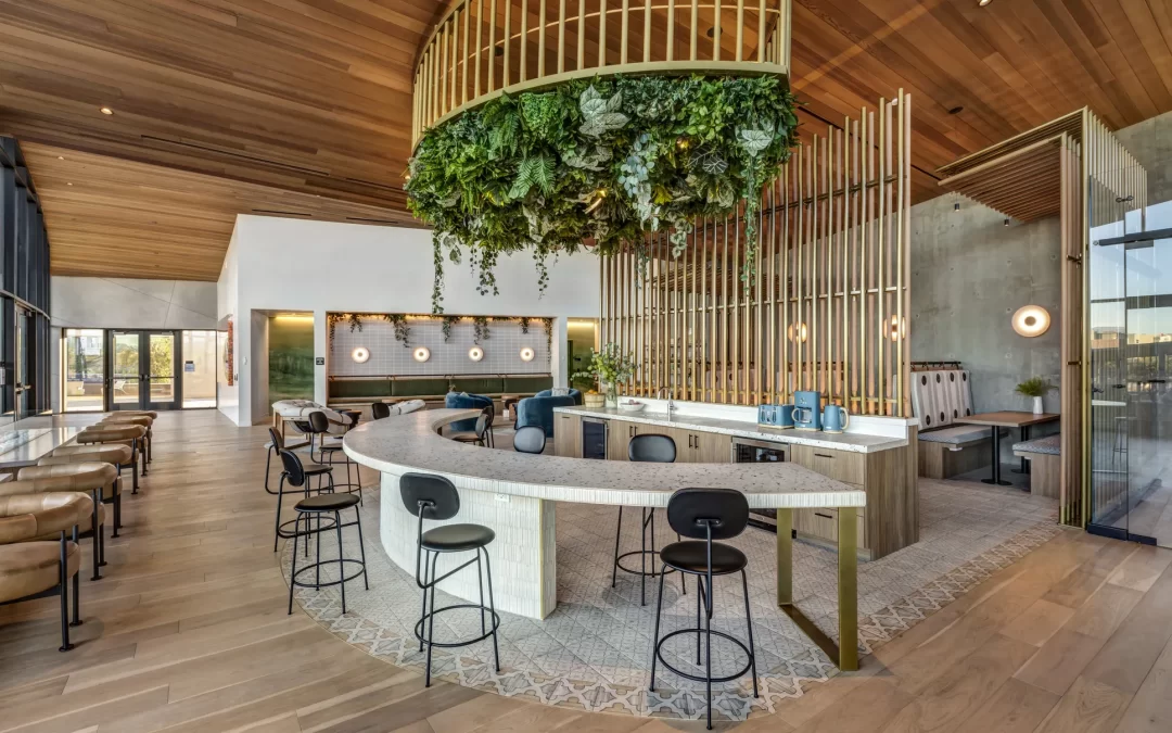
The Essence of Warm Neutrals
Warm neutral colors encompass a palette that includes shades such as taupe, beige, soft browns, muted golds, and warm greys. These colors are characterized by their subtlety and versatility, which allows them to harmonize with diverse design elements. The warmth in these neutrals comes from their undertones, often tinged with red, orange, or yellow, which imbue spaces with a sense of coziness and approachability.
Creating Atmosphere and Mood
When guests walk into a hospitality setting, they are not just observing colors; they are experiencing an atmosphere. Warm neutral color schemes excel in creating environments that feel both serene and sophisticated. Unlike stark whites or bold colors, warm neutrals provide a backdrop that is both elegant and subdued. This is particularly important in hospitality settings such as hotel lobbies, where guests are looking for relaxation after travel, or in dining areas where a calming environment enhances the culinary experience.
Enhancing Guest Experience through Design
In hospitality, guest experience is paramount. The use of warm neutral color schemes contributes significantly to this goal. These colors invite guests to unwind and feel at home while still providing a sense of luxury and exceptional service. A thoughtful application of warm neutrals can elevate a brand’s image, creating consistency across properties and offering a memorable aesthetic that guests associate with their experience.
Strategic Application in Spaces
The strategic use of warm neutral colors can impact various zones within a hospitality space:
- Guest Rooms: Using a palette of light taupes and warm greys can make rooms feel larger and more inviting, promoting relaxation.
- Lobbies: Incorporating earthy beiges and muted golds can enhance the grandeur and welcoming nature of entry spaces.
- Restaurants: Soft browns and deeper taupes in dining areas create an intimate atmosphere conducive to social interaction and enjoying meals.
Complementing with Textures and Materials
A well-curated neutral palette is often complemented by an array of textures and materials that add depth and interest to the space. Textured wallpapers, linen upholstery, wooden accents, and stone finishes can all enhance the richness of warm neutral colors. This combination brings a dynamic visual interest without overwhelming the senses, crucial for maintaining an elegant yet unobtrusive design.
Aligning with Branding
For hospitality brands, alignment with aesthetic identity is crucial. A neutral color scheme offers flexibility, allowing for subtle incorporation of brand colors through accent pieces and decor, thus reinforcing brand recognition while maintaining the primary color narrative. This means a brand known for its understated luxury can consistently convey this identity across its various properties.
The Psychology of Color in Hospitality
Color psychology reveals that neutral tones are associated with calmness, stability, and reliability. For hospitality entities, integrating warm neutrals can communicate these values effectively. Guests may not consciously recognize these associations, but they undoubtedly contribute to an overall positive perception and satisfaction.
Case Study: A Success Story in Warm Neutral Design
Consider a luxury resort that recently revamped its interiors using a warm neutral palette. By shifting from a stark minimalist approach to warmer tones, the resort experienced a notable increase in guest satisfaction. Feedback highlighted feelings of comfort and homeliness, with guests often referencing the inviting nature of the lobby and the soothing environment of the rooms. The use of complementary textures like velvet cushions and oak wood furniture not only added visual appeal but also enhanced the tactile experience.
Conclusion
Warm neutral color schemes are more than just design choices; they are powerful tools in creating memorable and engaging hospitality environments. By fostering an atmosphere of warmth and luxury, these color schemes help forge deep emotional connections between guests and spaces. For any hospitality brand aiming to enhance guest satisfaction and promote brand loyalty, embracing warm neutrals could be the key to crafting unforgettable experiences.